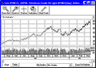
Interpreting a Chart
Previous  Top  Next

Below is an example of an Unfair Advantage chart for a Crude Oil contract:


crudechart

This is a typical market chart, with a title across the top, a price bar chart in the main body and volume and open interest below.

·The price scale is at the right.  
·The date scale across the bottom automatically adjusts for bar spacing of your data.  
·You can use the scroll bar and arrows below the chart to see the full scope of the selected data series.  
·This Chart Interpretation & Manipulation chapter lists the many ways you can read and manipulate your chart.  

The Price Bar


A price bar shows the price range by its vertical length. The high price is at the top of the bar; the low is the bottom of the bar; the open is a dash to the left and the close is a dash to the right. You can manipulate bars in a number of ways through the right-click pop-up menu's "Display Bars As" feature.